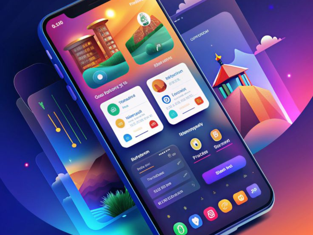
Building Seamless Experiences Across Devices
Responsive Web & Mobile App Development is the process of creating applications that work smoothly across all devices and screen sizes. Whether accessed from a desktop, tablet, or smartphone, the design adjusts automatically to ensure usability. This approach improves user experience and eliminates the need for multiple versions of the same app. Developers use frameworks and design principles that prioritize flexibility and adaptability. Businesses benefit by reaching wider audiences through a single solution. Users enjoy consistent interfaces, fast loading, and easy navigation everywhere. Ultimately, responsive development makes digital platforms more reliable and accessible.
A responsive app doesn’t just adapt to screens — it adapts to people
Responsive Web & Mobile App Development focuses on creating applications that adapt to any device or screen size. It ensures users get a smooth, consistent experience whether on desktop, tablet, or mobile. This approach reduces costs, improves accessibility, and helps businesses reach a wider audience with a single solution.
Responsive Design for the Web and Beyond
Responsive development uses technologies like HTML5, CSS3, JavaScript, and modern frameworks to ensure adaptability. Media queries and flexible grids allow layouts to scale across devices. For mobile apps, hybrid and cross-platform tools like React Native or Flutter provide seamless performance. APIs are integrated to support real-time functions across both web and mobile platforms. Performance optimization ensures fast loading and smooth navigation on limited bandwidth. Testing is carried out across multiple devices to guarantee compatibility. This technical process ensures robust, future-ready, and scalable digital solutions.

Future-Ready Web and Mobile Applications
Responsive Web & Mobile App Development provides significant benefits for businesses and users alike. For businesses, it reduces costs by maintaining one platform instead of multiple versions. It also ensures faster updates and easier maintenance. Users benefit from a smooth experience regardless of device or screen size. The design consistency improves brand trust and customer satisfaction. Responsive apps also perform better in search engines, driving more visibility. This approach ensures businesses stay competitive in the digital-first world. Ultimately, it creates applications that are flexible, efficient, and user-friendly
